
The Evolution of HPD Vehicle Graphics
A quick story on HPD's vehicle graphics spanning the last 30 years.
This is what our cars looked like in the 70's, 80's and early 90's.

76 Le Mans. Photo submitted by Ray Simper

78 Catalina. Photo submitted by Ray Simper
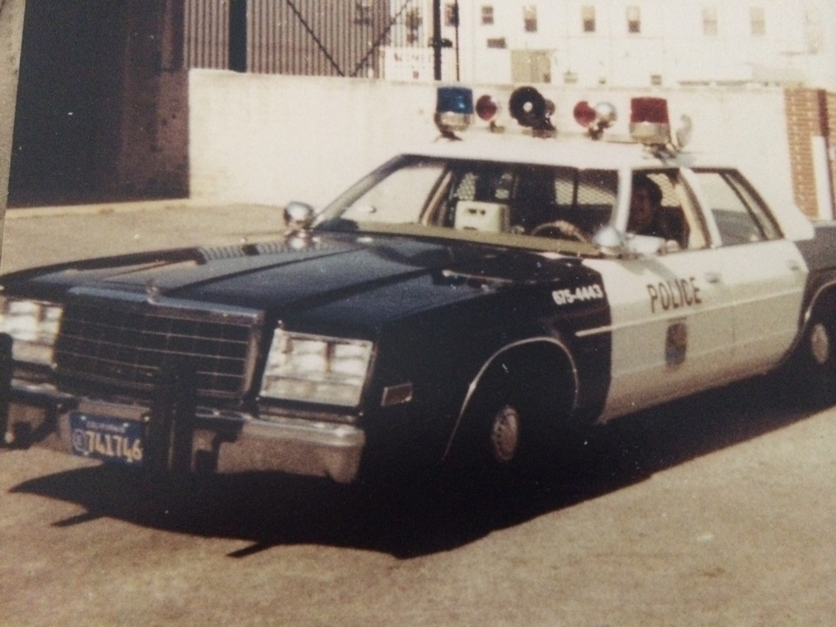
Photo submitted by Ray Simper
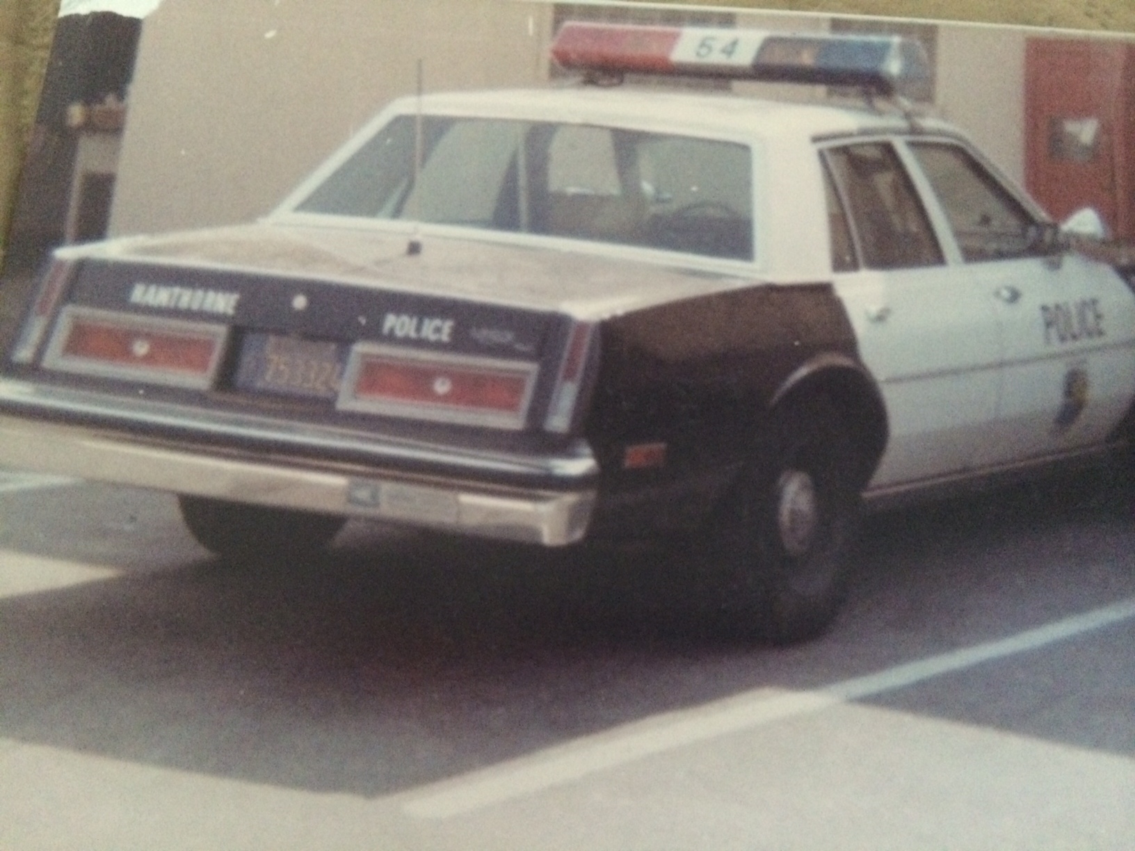
Photo submitted by Ray Simper
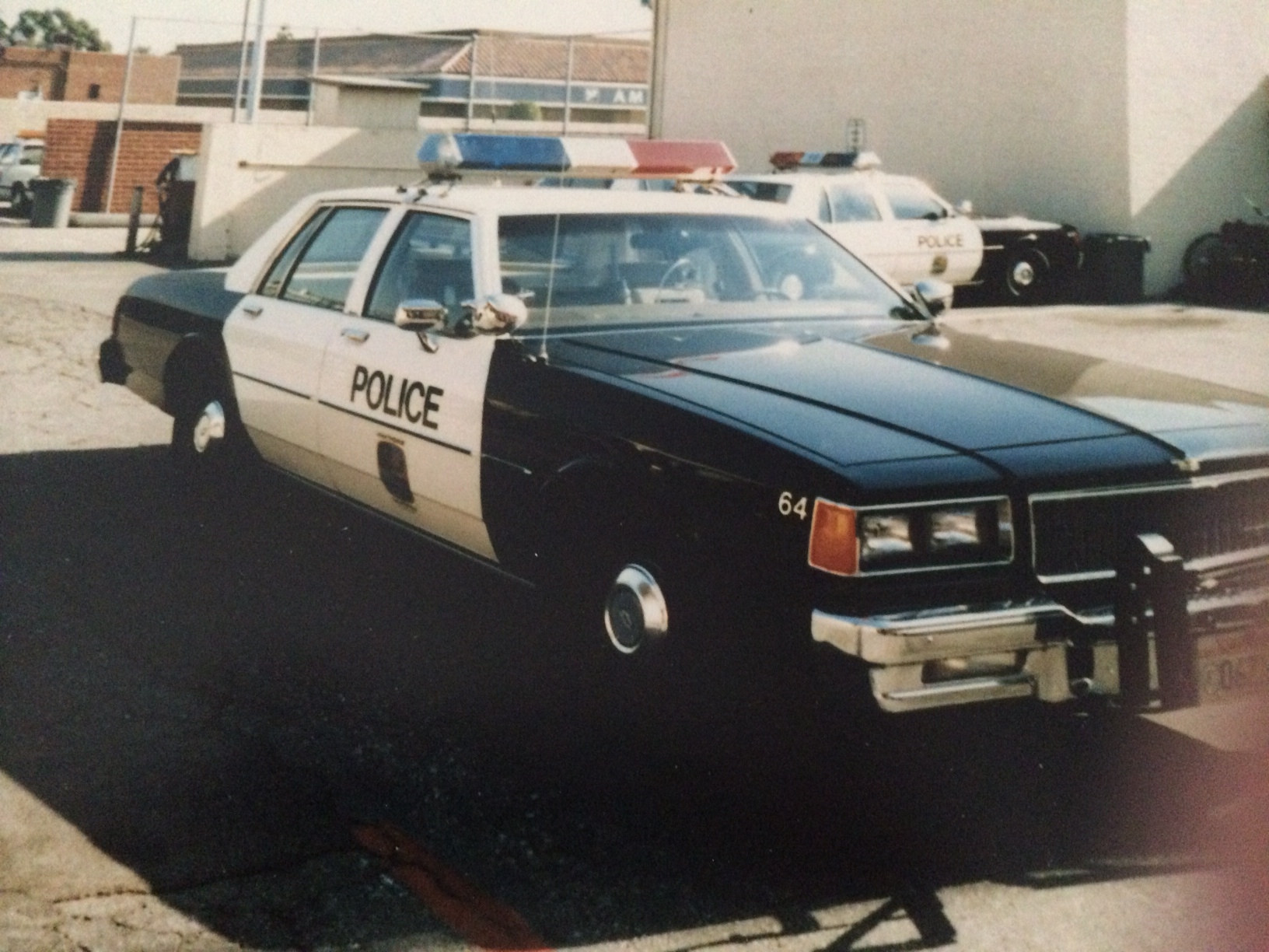
Photo submitted by Ray Simper
Photo submitted by Jeff Robertson

Photo submitted by Jeff Robertson

Photo submitted by Jeff Robertson
Photo submitted by Jeff Robertson
We made our first significant switch on the Police graphics back in the mid 1990s. Most agencies still had simple graphics with the city seal on the door. To have the big "Police" in blue (with subtle grey stripes behind it) was a big change and it took some time for our officers to warm up to it.
Photo by Mike Mullen

Photo submitted by Ray Simper
Photo by Mike Mullen
In the early 2000s, more agencies were moving beyond the standard city seal and beginning to use more and more color in their designs. The standard across California at the time was a colorful and prominent “police” on the side of the car in a raised font. We liked and enjoyed our 1990s era design, but in 2003, Chief S. Port was looking for a change when the fleet was changing from Chevys to the Ford Crown Victoria. He tasked the traffic bureau commander with looking into a new design with little direction other than he wanted something updated, forward, and unique to accompany the new Ford’s.
We sought out a graphics designer and brought a new car over to his shop to begin working on a new design. It was important to us to maintain Hawthorne’s identity from the previous era so we tried to build forward slanting grey lines and the blue hues. You’ll notice that we kept the two forward slanting stripes behind “police” but made the front stripe thinner than the one that follows it. When the design morphed into having the stripes cross, a lot of discussion occurred as to which stripe should be on top. Symbolically, we decided to have the larger (standard and previously used design) stripe, cover the newly updated thinner stripe, which spoke to the importance of Hawthorne tradition. When we first saw the new design stripes on a new Ford, we knew we had a great combination. But, there was a problem.
We liked the stripes so much, less attention was placed on the “police” logo so originally, we picked the standard Hawthorne blue of the previous era, changed the font, and thought we would be progressive by having the blue fade from dark to light. We did a minor update on “Hawthorne” and drove the prize possession back to the station. Chief Port was asked to come look at the new design on the car that was parked behind the old traffic bureau.
Chief Port looked intensely at the vehicle, paused for what felt like an eternity and said, “yeah, I like it. I think it’s fine.” When he walked away, we were crushed, knowing full well it wasn’t good enough. We immediately drove back to the graphics company. While walking through this completely unorganized mess of shop, we found a small roll of carbon fiber. We updated the stripes further with thin blue pin striping an then went bold and wide with a carbon fiber “POLICE” spanning well across both door. We found the most forward and modern font possible for “Hawthorne” and “service with respect” and then darkened the blue to keep the focus on the subdued black and grey carbon fiber. We also added a subdued black and grey American flag behind the passenger door. Back to the station we drove.
The Chief was asked to take another look at new design and he immediately responded with, “I told you I liked your design, it looked fine.” We told him we didn’t love it and asked him to take another look. When he saw the changes he didn’t say anything but started to smile. Just then a citizen happened by be walking though the lot headed to the library and Chief Port said, “Hey what do you think about this new car?” She looked carefully and responded, “that thing looks bad @#%$#!!” Chief Port turned to us and said, “now that’s a police car” and walked back to his office.

And in 2014, as we switched to the new Ford SUV Interceptors, we felt it was time to take another look at our graphics. Many agencies have incorporated the more subdued "grey or black" police logo in big font along with the city logo on top in a smaller font. This seemed to be the current "standard" in Southern California police car designs (i.e. everyone looked the same, like THIS).
Keeping with our tradition and culture of an agency whose vision is “always willing to pioneer innovative approaches to law enforcement” we were looking for the same "wow" factor garnered ten years earlier. As with many innovations in law enforcement, we usually find that many progressive ideas and technologies are developed in the private sector. With new graphics and vinyl wrapping technology available, we now had the ability to incorporate the entire vehicle as a design element, not just the doors (if you Google photos of any high end car or food truck, you will notice many are wrapped in 3M vinyl). With this new technology in mind, we decided to push the design element forward.
Design goals:
Non-traditional black/white theme.
Highlight the matte colors as part of the design element, not just the logo.
Move away from ‘busy’ graphics and go for clean and modern look
Make HAWTHORNE and the Hawthorne brand the focus, not POLICE
Use reflective technology for visibility and safety
Carry forward the designs from the past two eras
Bold, uncluttered, and a forward design that does not resemble current design trends.
Incorporate the "European look" on the hood with the backward police logo
Ability to change/replace graphics quickly with the use of the vinyl wrap
Incorporate small details in the design that honor our fallen officers (still finalizing design)
We worked with a company that specializes in vinyl wrap and asked their art designer (Joe from Wrapbullys) to incorporate current technology in vinyl wrap design. We asked Joe to come up with three designs that we could choose from. The first two being more traditional, and the third design as something totally different, something that would be "cool" from a non-cop perspective. What you see here is the combination of the first and third designs.
Vehicle design is an important way for Police Departments to present an image and brand of their respective organizations. Like professional sports, the game being played is the same but each team carries their own unique culture and brand identity. For departments such as the Los Angeles Police Department or the California Highway Patrol, not changing the graphics is their actual brand (thanks to TV shows such as ChiPs and ADAM 12). Their brand is so strong in the eyes of the public that their traditional graphics enhance their image. We believe our latest car design enhances HPD's image of being progressive, innovative, willing to take chances, and not afraid of being different. This is the 2014 HPD.
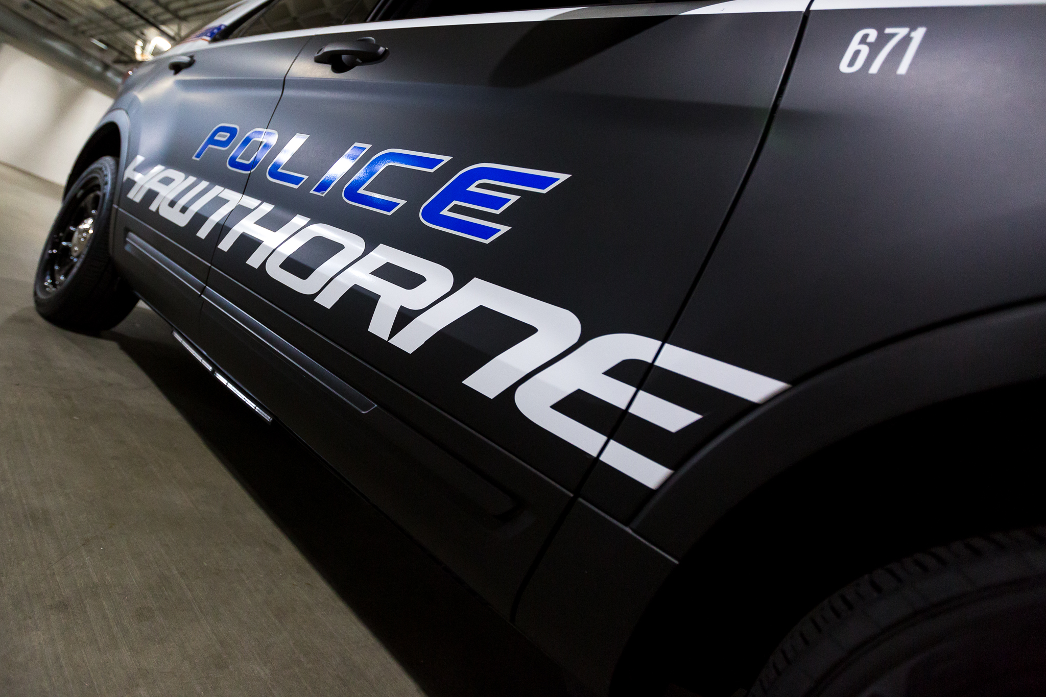
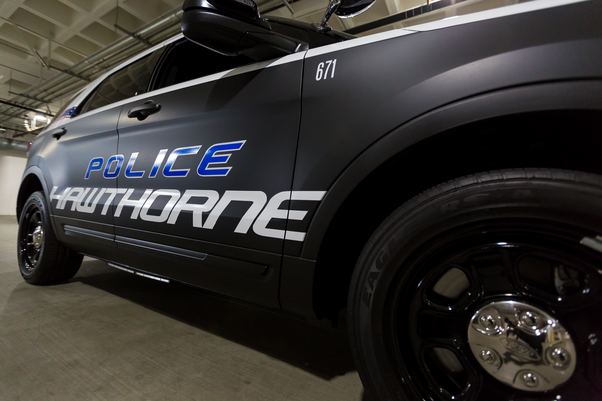
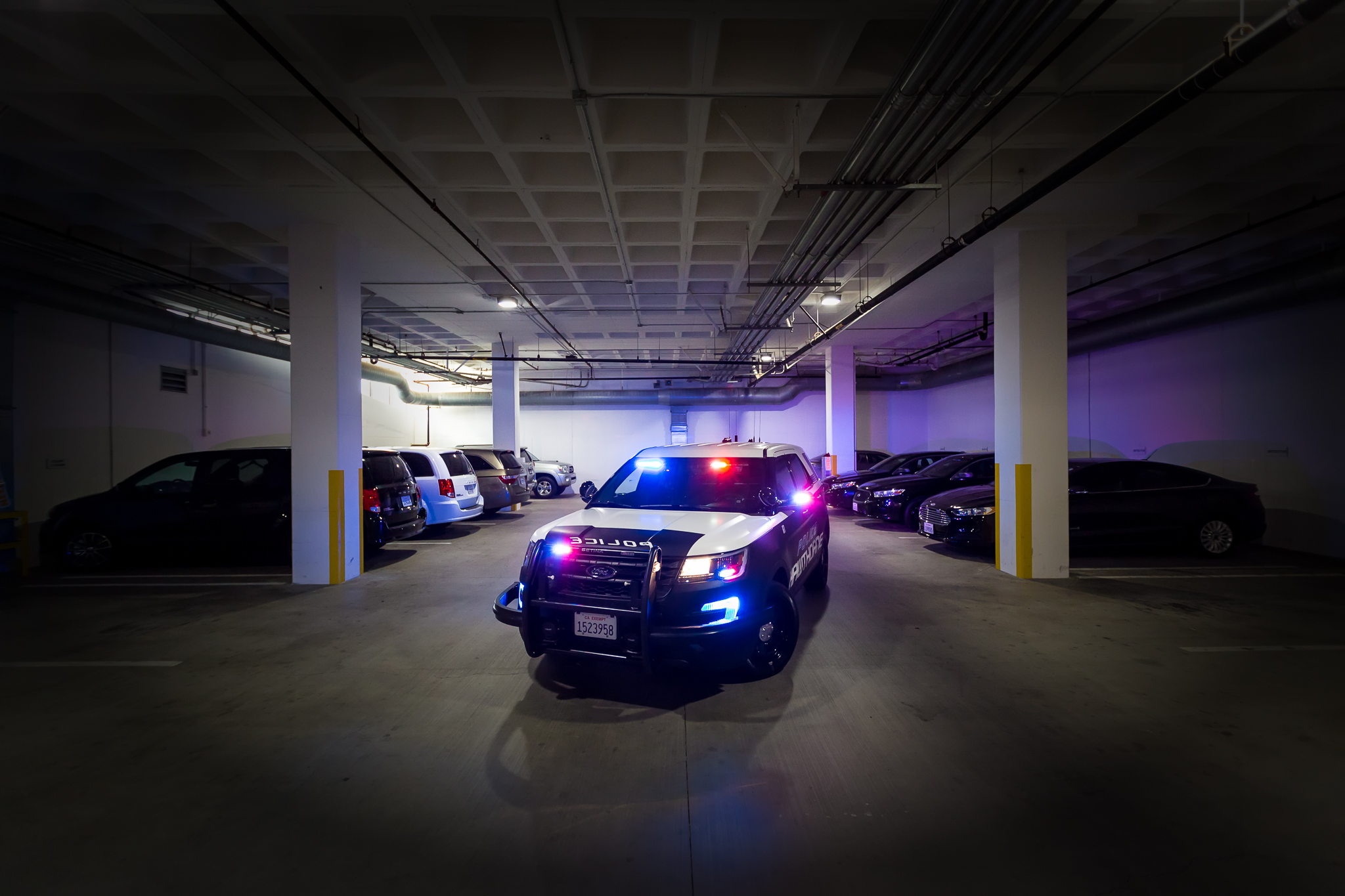
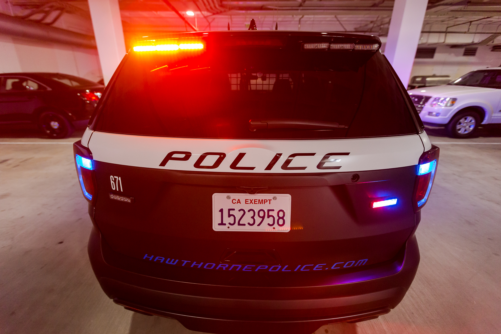
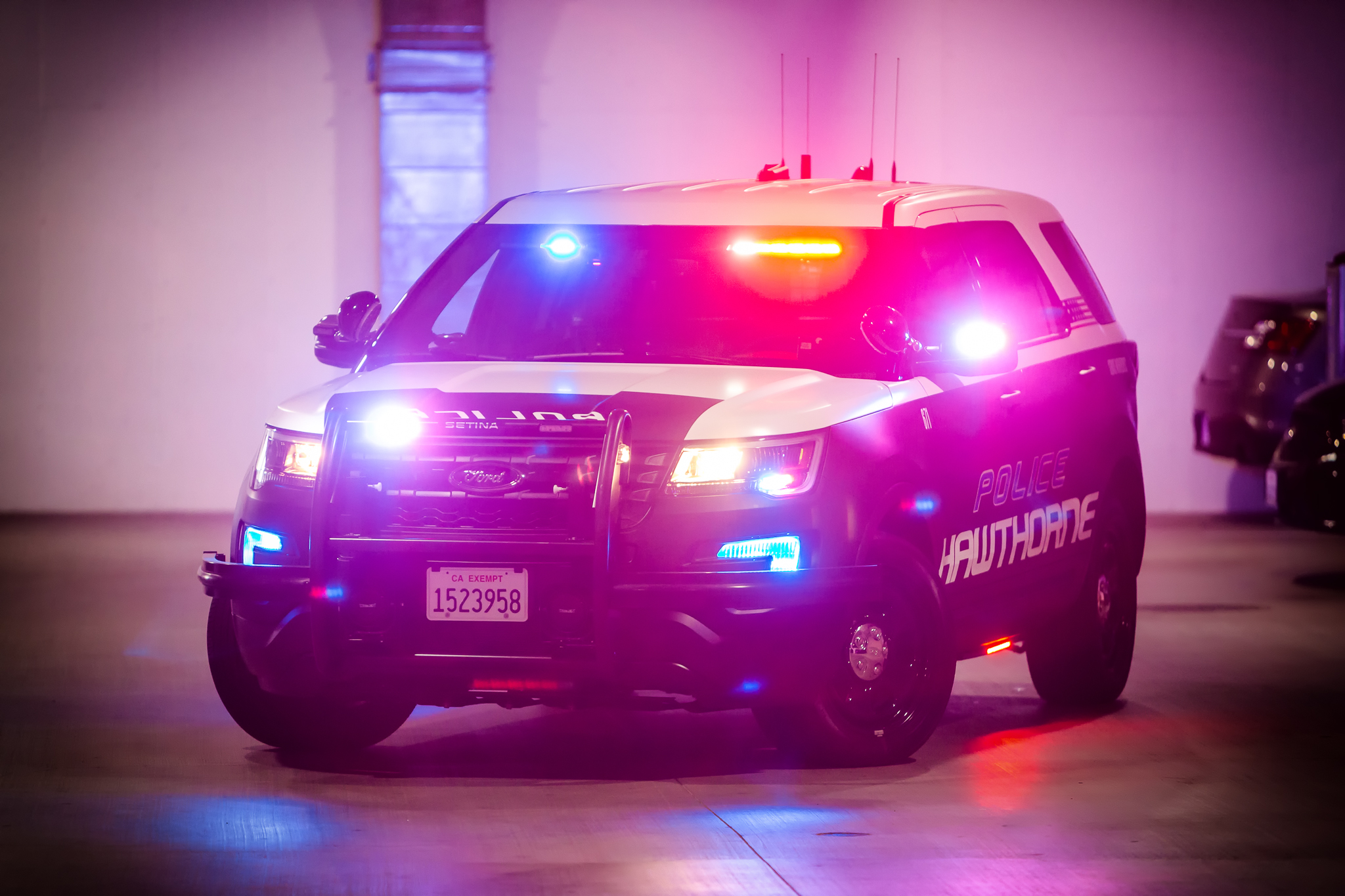
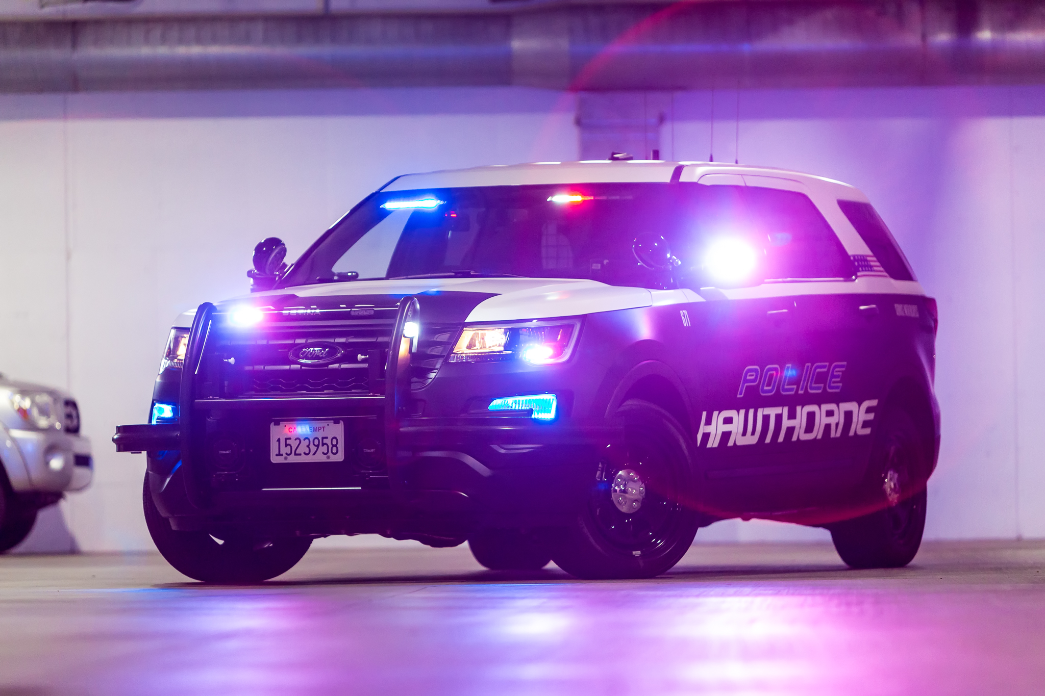
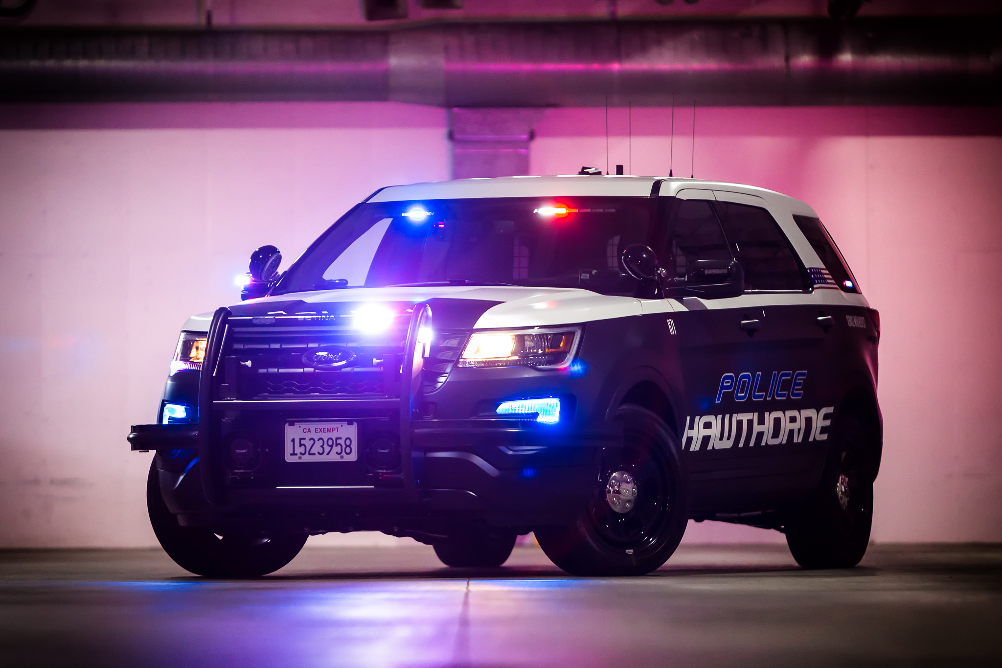
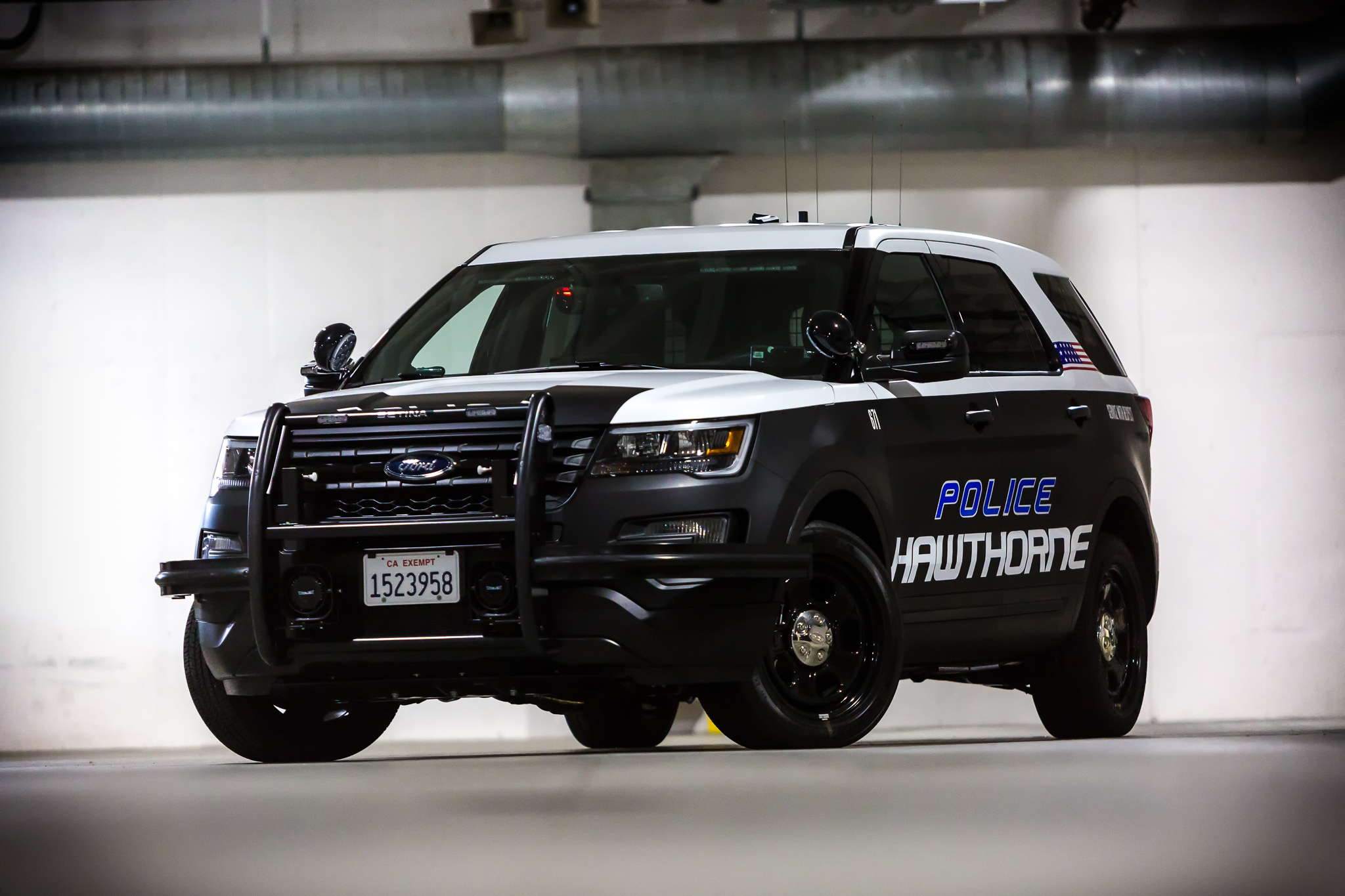
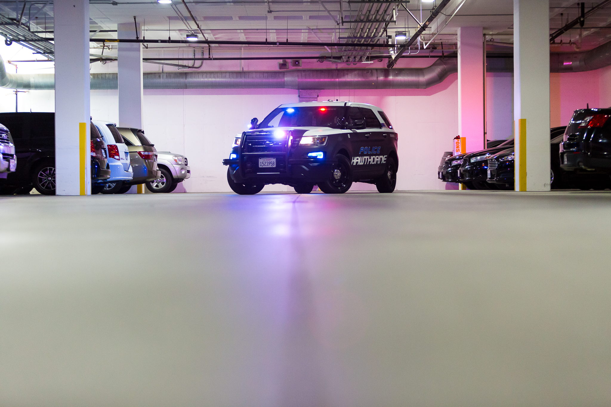
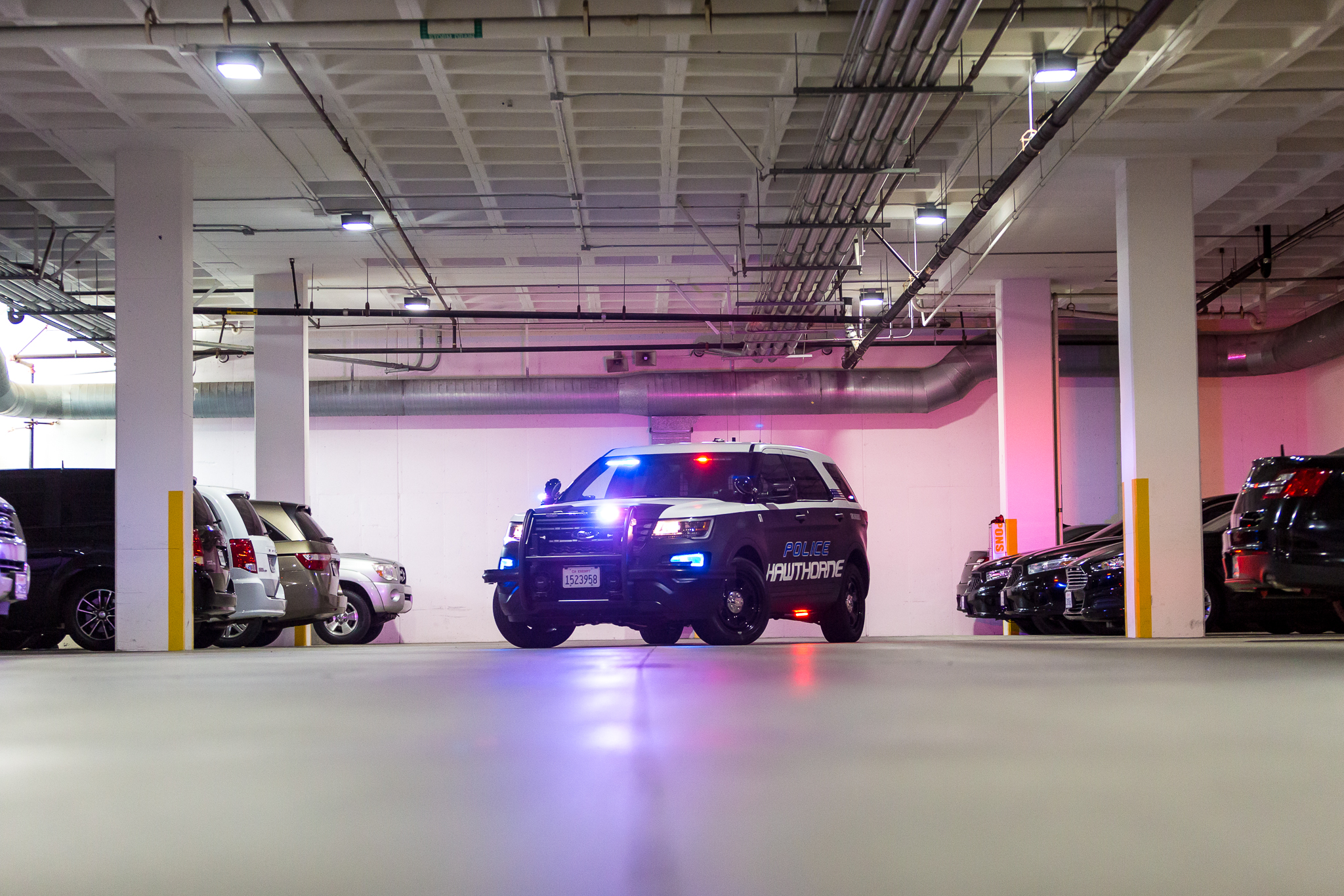
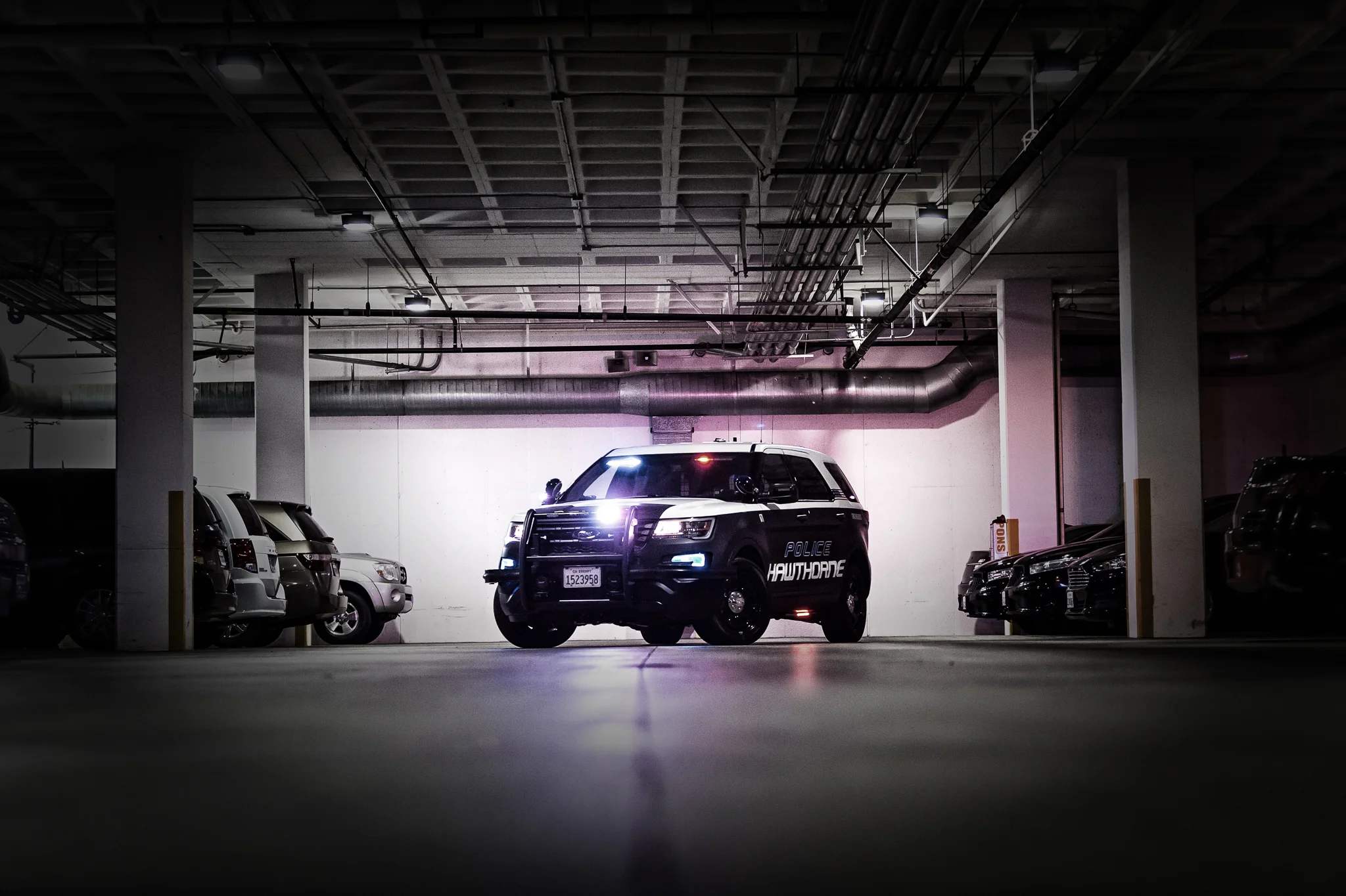
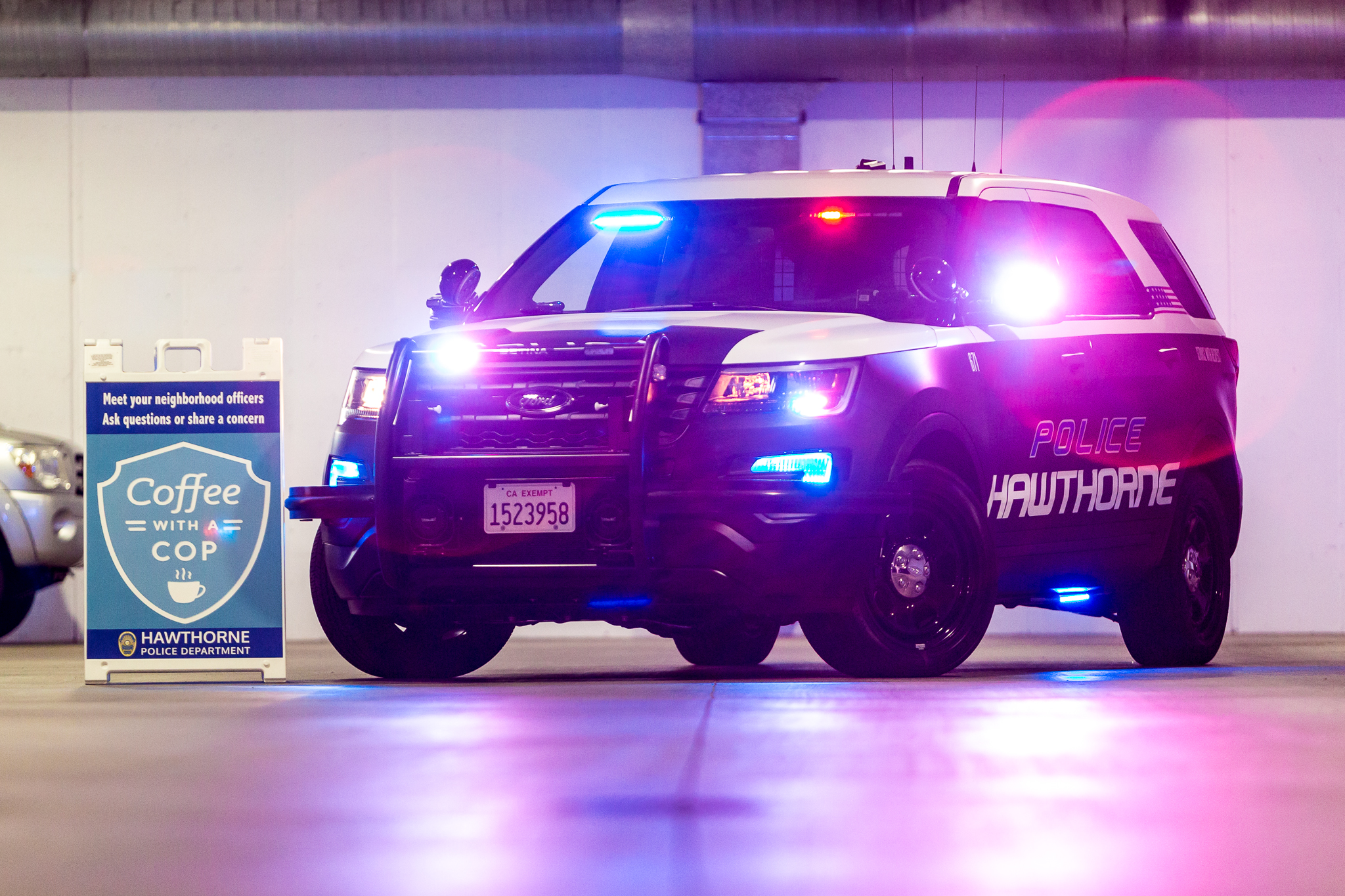
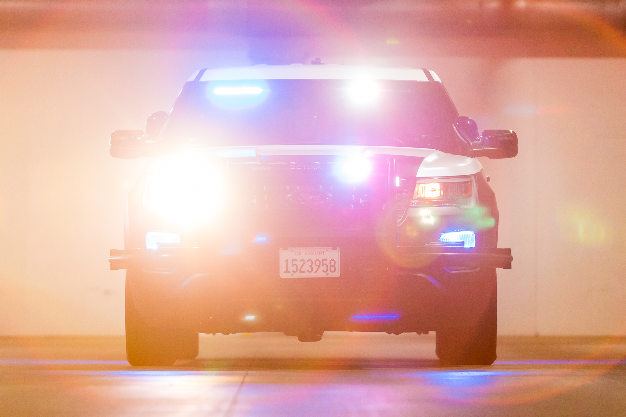
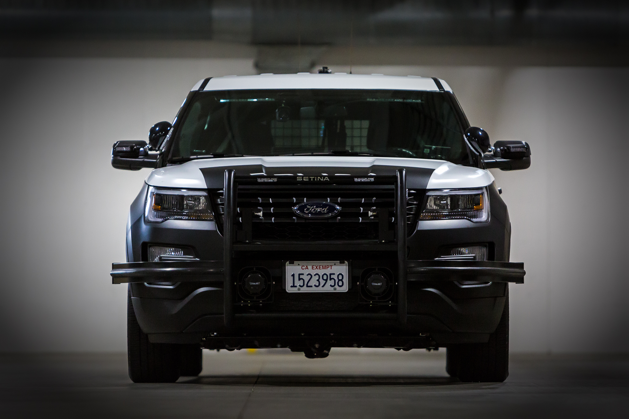
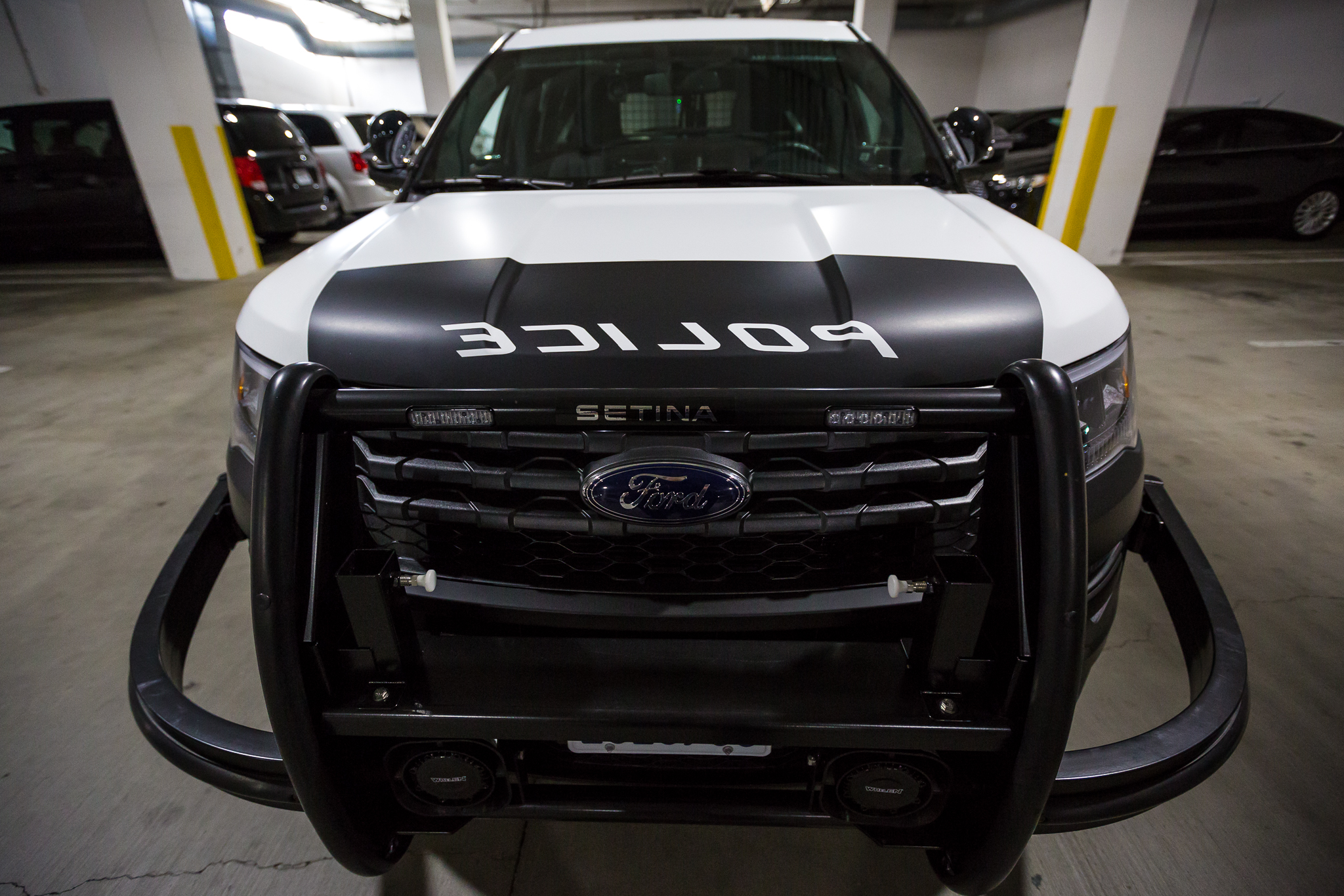
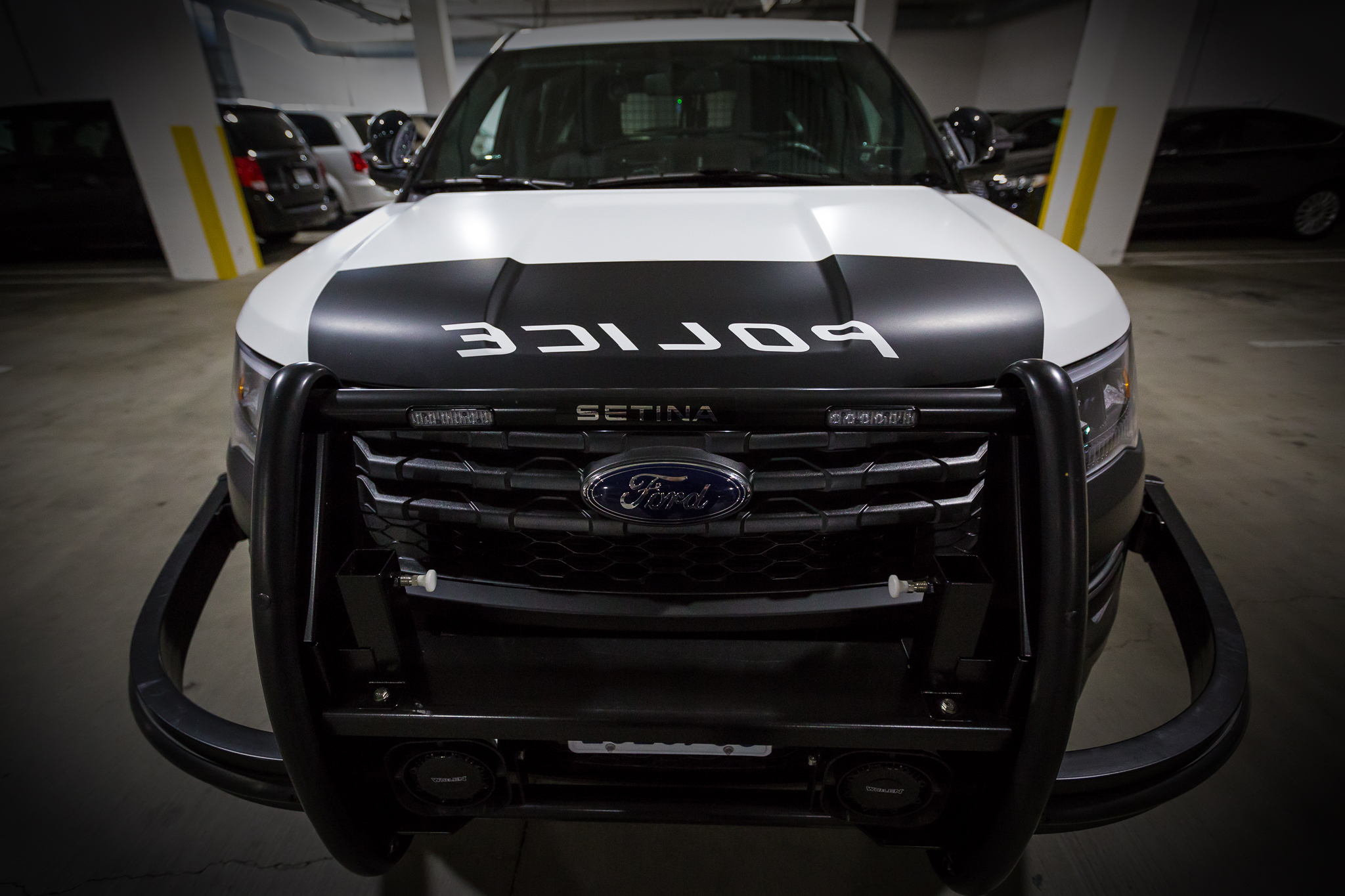
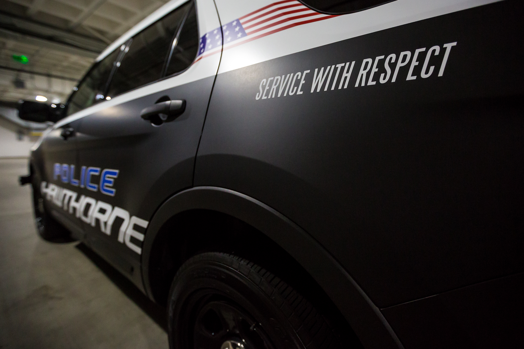
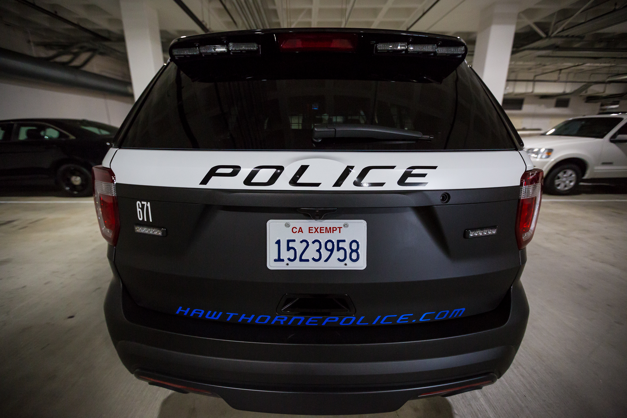
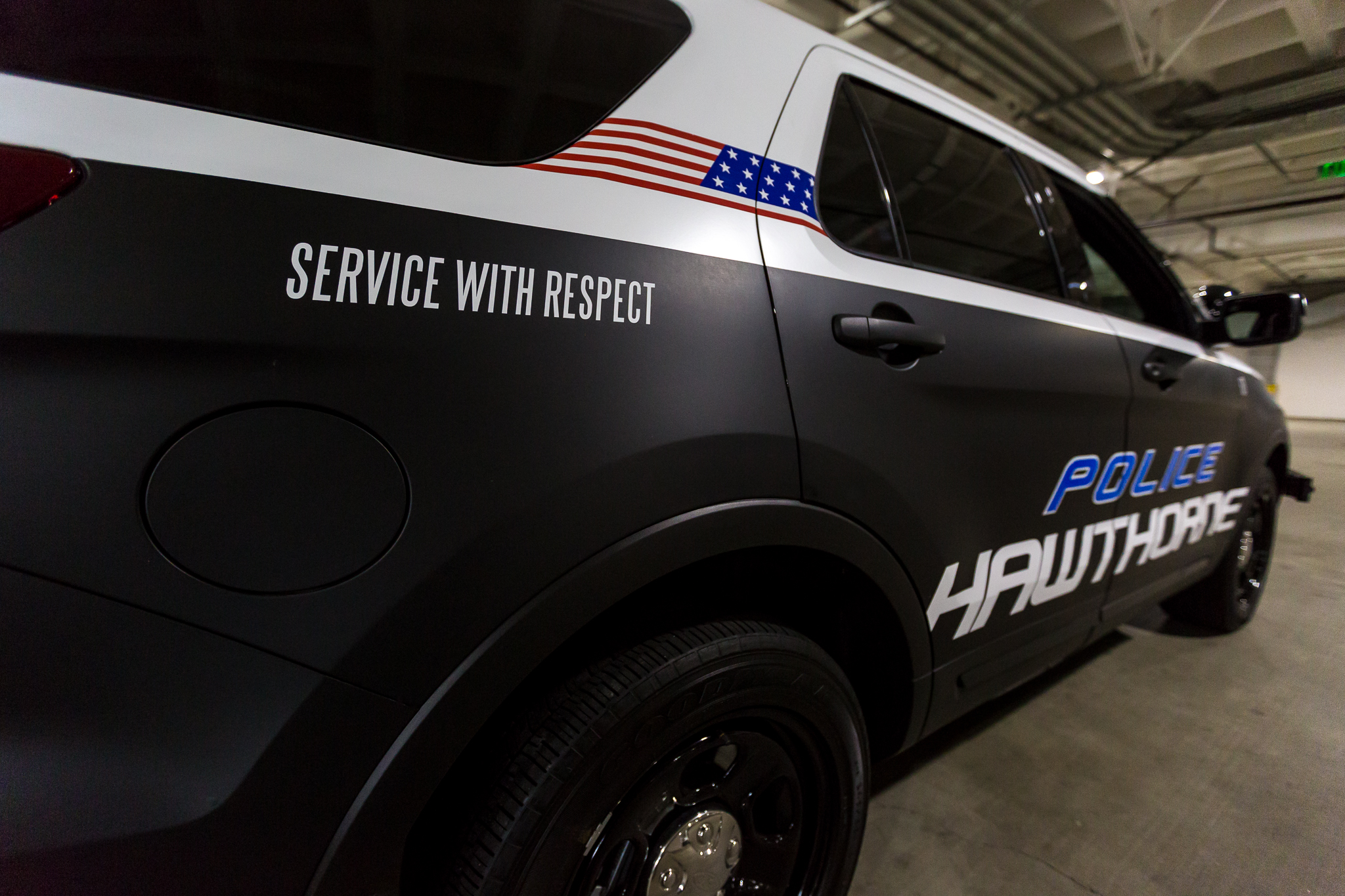
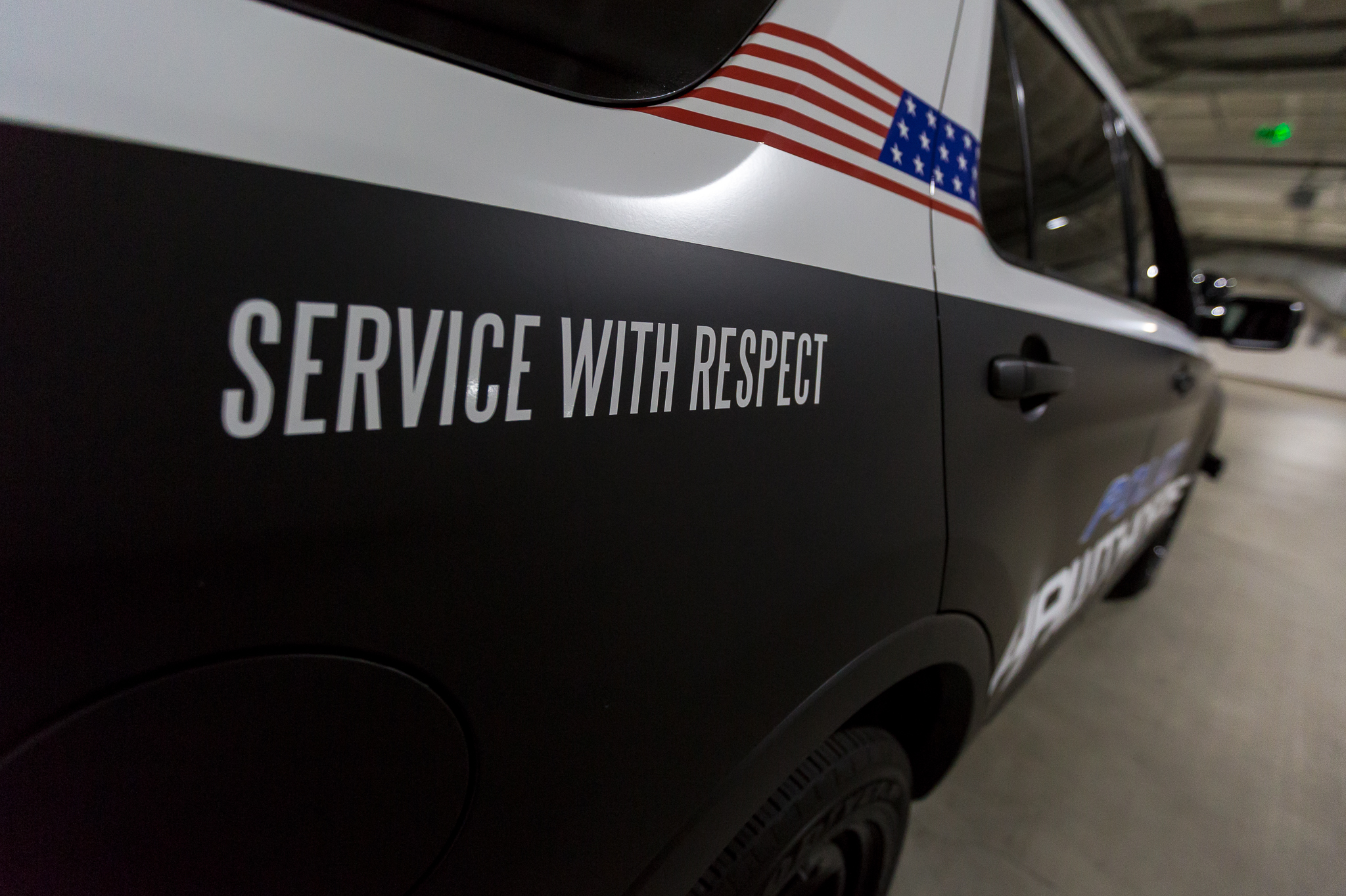
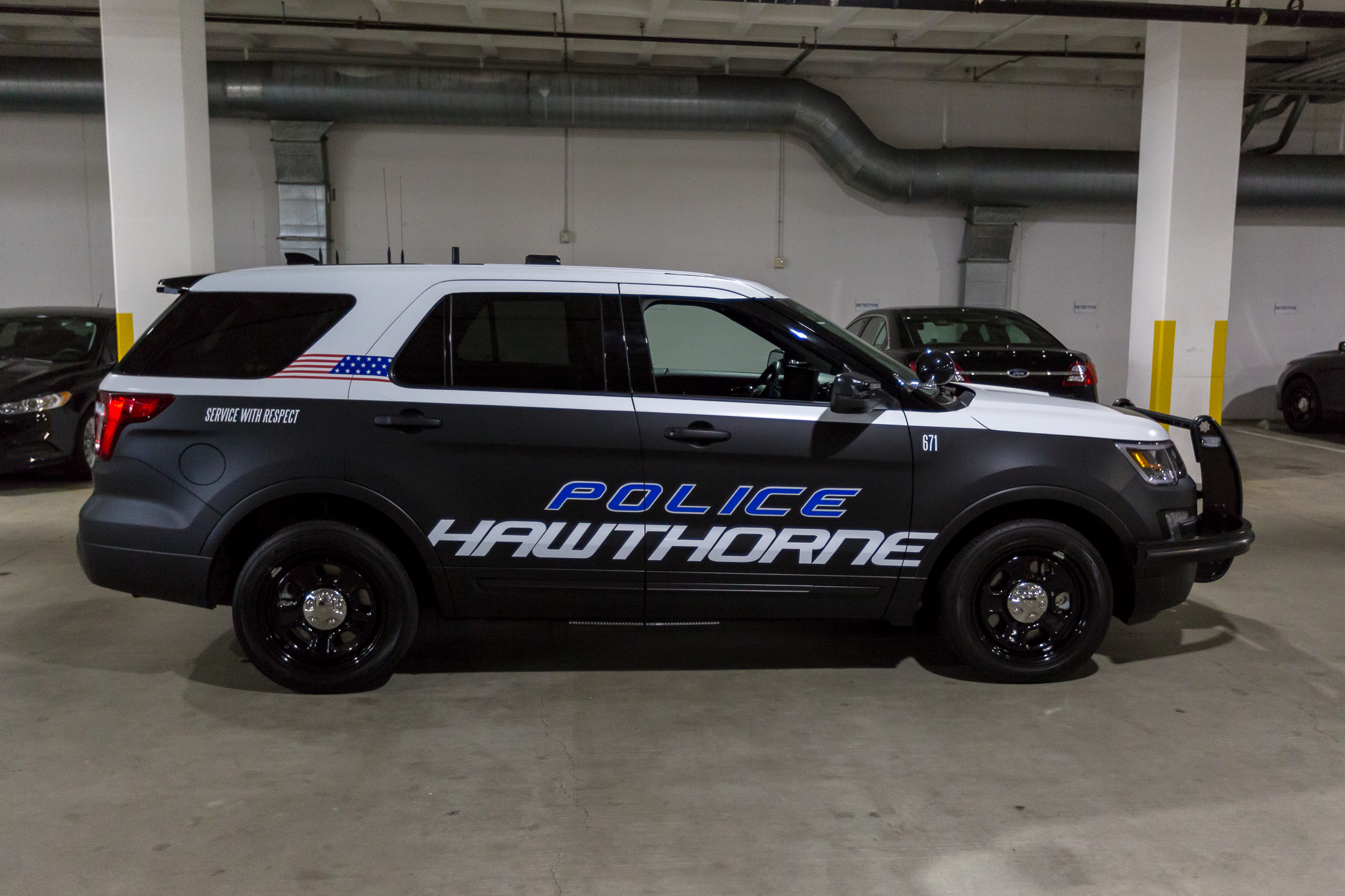
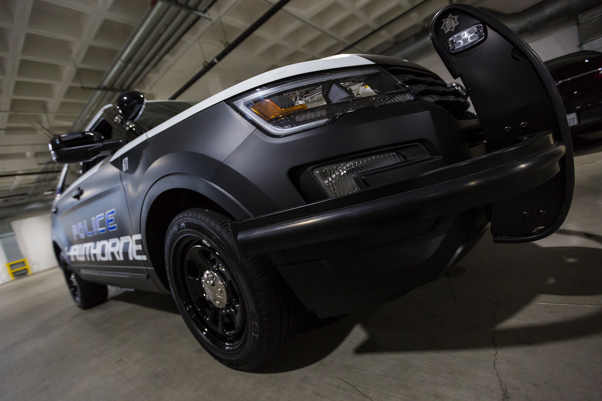
Photo by K9 Officer Lewis of partner 'Mido' June 2016